I just happened to have my compact digital camera in hand. I was early for my lecture. So I walked around the Lecture Halls corridor (I think they call it the DK foyer, I call it Upper Penang Road, USM).
There are softboards along both sides of the wall. I was just wasting time, and started clicking on the flyers and posters.
The one on the left says its looking for "potential girls who is proud of their origins and is able to parade Malaysia's culture and tradition in style". Want to participate? Send in 2 photos, one a head shot and the other full body shot. Wait. You must be in a white T-shirt and jeans.
Hmmm, since when has white T-shirt and jeans been part of Malaysian culture and tradition? Ooops, sorry, am I living in the Dark Ages? I guess the organisers just want to "size up" the candidates.
The poster on the right? Something about a competition to promote domestic tourism using mobile technology. As graphic design goes, I would say the one on the left wins hands down.
This one is obviously done by professionals. What jumps at you? The brand of course. And then? The ladies in silhouette as the four fingers. But I done get it - what does the hand say? Now, it stops you, make you read and you find out its a campaign to get students to recycle their deodorant plastic bottles.
Now pause a second. I get this idea that it's targetted at ladies. And suddenly, I a sense that female students in our local universities must be using lots and lots and lots of deodorant. Correct?
Well, at least they have the decency (or magnimity) to say any brand of deodorant is accepted. You stick a label with your name and stand to win a prize. I'm suspicious. I think it's a "scam" to collect data about brand preferences amongst students in the universities. Sorry, I seem to be in sceptic-mode. I guess it's my bipolar character.
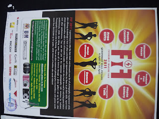
This one is a photo competition. Now if you look at it from far, what would be your first reaction about the theme? One of those catwalk or models show on reality TV, right? No, no, no. The theme is "Life in Penang". One thing I can say, good photographers do not a good graphic artist make.
Like this? A far as posters goes, right on the dot. Good use of white space. Unclattered. And the most important message jumps at you. "EXHIBITION". and then "Final Year Project". You can even continue walking without having to stop and still get the message. In terms of artistic design though - so so.
I would say this a reasonably good effort. You read the big letters and if you are interested, walk nearer to read the fine print. Doesn't cost a bomb to do or reproduce.
Put two posters next to each other and you double the attention-grabbing ability. One look and you can guess its related to something Chinese. Of course! But wait, I can't read Mandarin.
The poster above and the one below are from the same campaign but obviously done by two very different designer. There isn't a "united front" here. I chatted with two of the organisers and essentially gave them a hard time but wanted to support their Charity Walk, if they could change some of the way they were going about it. Like giving a free t-shirt to every participant and I think water in plastic bottles, and so on. They promised to come back to talk to me. They didn't. I am guessing their advisor said "tell him to mind his own business". Na, I think it was too late for them to make changes. So, anyway, good luck.
This one is done by a designer who doesn't understand the concept of poster and graphic design. OK, ok, maybe it's just old school.
People who don't care where they put their banners or posters or flyers. Preferably "in your face". Irritates you like hell, don't they?
But there is hope ...


4 comments:
Yeah! funny yet nice description on poster design!!=)
Did sir learn design before?
learning means just pick up a book, read, then apply ... glad you found it funny. I'm sure some ppl may find it offensive.
fuck you
Yes, I read you loud and clear. I will let this one stand, as a reminder that we are still a community unable to accept other points of view.
Post a Comment